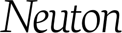
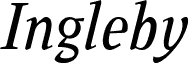
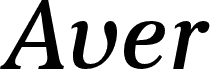
Neuton Italic, designed by Brian M Zick, is a free serif italic with a brisk slant and pronounced thick-to-thin contrast. Broad capitals carry sharp, tapered serifs, and the compact lowercase moves with a clean, controlled, flowing rhythm.
Book covers are its strongest setting, with enough formality for literary journals and exhibition catalogs and enough movement for restaurant and wine menus. In editorial design, it can distinguish introductions, pull quotes, and section openers with a warmer voice than the companion upright roman.
--
Martin Silvertant is credited for the promotional image.
http://MSDesigns.deviantart.com/
Neuton is licensed under SIL OFL and is free for commercial use.
Neuton has a large height, short extenders, and a compact width.
Neuton is under continuing development. The family will comprise regular, italic, and cursive styles in five weights, from Extralight to Extrabold. The two italic styles are called “italic” and “cursive.”
- Small-caps versions
- Extended-width versions