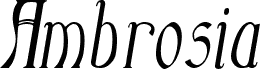
Echelon Italic by Ray Larabie of Typodermic Fonts Inc. is a free high-contrast serif with an elegant, sharply cut profile. Its tall, narrow letters combine sweeping curves, fine joins, and pointed serifs for a distinctly fashion-conscious edge.
Luxury fashion and fragrance brands could use it for logos and packaging with slender, dramatic lettering. The same refined shapes suit magazine covers and formal event invitations. It will appeal most to designers working in upscale editorial, beauty, and boutique markets.
--
Echelon was created in late 1999 using vector-editing software on a Palm computer. As far as I can recall, it is the only font I designed using software other than Fontographer or FontLab. I developed almost all of Echelon’s characters during a round-trip flight between Toronto and Seattle. I entered the font in a contest and won FontLab, which I still use. I later revisited Echelon and added support for more languages, punctuation, and mathematical symbols. The font remains free.
The included license permits free commercial use, sometimes referred to as a desktop license. It allows you to install the fonts on a computer and use them for commercial design work. Read the license agreement for details.
Embedding the fonts in an app, e-book, on the web, or in anything else not covered by the desktop license requires a different license. Consult the licensing information on the Typodermic Fonts website or contact me for assistance.
https://typodermicfonts.com/license/