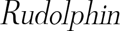
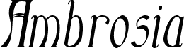
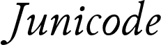
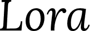
SF Phosphorus Trichloride, designed by Derek Vogelpohl of ShyFoundry, is a free high-contrast display serif with an elegant, severe profile. Its towering narrow letters shift abruptly from broad strokes to hairline-thin curves. The long, tapered forms feel theatrical.
As a dramatic title treatment, it suits fashion editorials and perfume packaging built around elongated silhouettes. Its sharp contrast can also lend poster work the poised tension of a vintage theatrical bill. Book covers and event invitations also suit its gothic elegance.
Copyright (c) 2008 by ShyFoundry. All rights reserved. Freeware for personal use only. To purchase a commercial license, please visit our site at http://www.shyfoundry.com.
Schriftfamilie
SF Phosphorus Trichloride
Schriftunterfamilie
Regular
Einzigartige unterfamilieidentifikation
ShyFoundry: SF Phosphorus Trichloride: 2008
Vollständiger schriftname
SF Phosphorus Trichloride
Name-tabelle version
Version 1.1
Postscript-schriftbezeichnung
SFPhosphorusTrichloride
Schutzmarken
SF Phosphorus Trichloride is a trademark of ShyFoundry.
Hersteller
ShyFoundry
Designer
Derek Vogelpohl
Beschreibung
For additional information about the usage of this font, please read the included ShyFoundry Freeware EULA or visit our site at http://www.shyfoundry.com/licensing.
Erweiterte Schriftinformationen
Unterstützte Plattformen
PlattformKodierung
UnicodeUnicode 2.0 und nachfolgende Semantik, nur BMP-Unicode