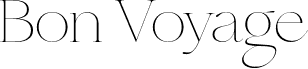
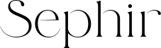
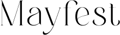
Yves Michel is the designer of the wonderful Via Appia, a clean, roman-style font that’s designed for print. It’s a classic and legible typeface, carrying the right atmosphere for editorial content, headlines, movie posters and even business cards.
You can choose between the classic Via Appia or the Via Appia Twin for a wider perspective with more spacing between letters. It’s available in uppercase, lowercase, numbers, and punctuation and comes in TTF format.
--
This "shadow" font is derived from the originally empty contours of the "Via Appia" font.
In a graphic program, when you typeset the same text in two separate frames at identical sizes-one using the normal font and the other using the shadow font-and overlay these frames precisely, you achieve a combined effect of letters and shadows. To enhance this visual, fill the two frames with different colors or gradients.