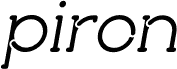
Kontrapunkt Light Italic by Bo Linnemann of Kontrapunkt A/S is a free high-contrast serif italic with a poised, literary air. Its slender, sloping letters combine crisp hairlines with fuller strokes, gently tapered details, and subtle wedge-shaped serifs. Broad curves, open spacing, and long sweeping diagonals give the wide rounded forms an elegant, composed look on the page.
A refined editorial tradition makes it especially apt for literary magazines and book covers, where its measured forms suggest serious, thoughtful content. It also suits invitations and cultural branding. The calligraphic slant connects those uses with poetry, classical music, and other arts-led subjects.