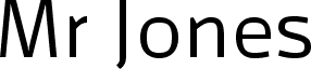
Galette by Jan Schmoeger of Paragraph is a free geometric sans serif with slim, even strokes and a spare, contemporary outline. Its rounded curves soften the firm vertical construction.
Technology and architecture are natural subjects for its precise, engineered forms. That restraint suits identity systems, exhibition posters, and product packaging with a modern industrial slant. In editorial design, it can give magazine headings and section markers a crisp structural thread.
--
Galette is a sans-serif font designed for print and on-screen display. The same layout can be used for printed material and online delivery without loss of quality or legibility. It includes extensive kerning and was designed for clear, uniform display on computer screens. It uses no overhangs, and the stroke thickness of uppercase and lowercase letters is identical, allowing smoother hinting and antialiasing at different point sizes and zoom levels.
The font includes alternative capital letters and accented characters for Western European, Eastern European, Baltic, and Turkish languages.