Farisea Dark
TrueTypeZum persönlichen Gebrauch
- Euro
Farisea-Dark-demo-ffp.ttf
Stichworte
Anmerkung des Autors
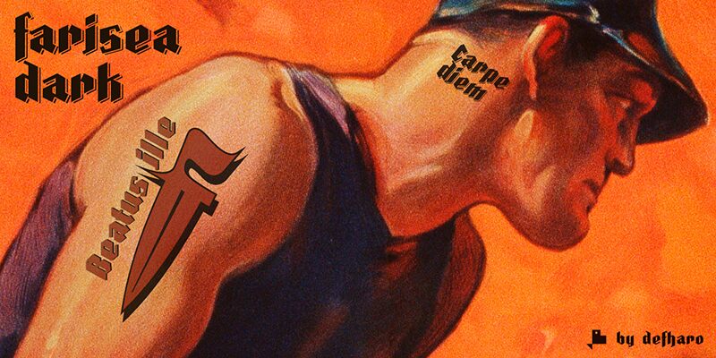
Fraktur is a typographic style of the Latin alphabet derived from the Gothic writing that arose at the beginning of the XVI century and was popularized in Germany, Northern Europe and the Baltic countries. These fonts are distinguished by their thick strokes and the angled profile produced by the pen. Farisea Fraktur is my modern version of this type of Fraktur fonts, without embellishments, the initial inclination is of 64 for the upper and lower ascending finials, it has a great contrast between antlers and a generous height of x, which gives the font in a square proportion.
On this occasion I offer 4 versions of the typography combinable by layers to create multicolored holders purely typographical. Today, this type of fonts continues to be used for the creation of diplomas, etc. also in some German-speaking press media, also having many followers among tattoo enthusiasts.
=============
OTHER STYLES & COMMERCIAL LICENSES: https://defharo.com/fonts/farisea-fraktur/
On this occasion I offer 4 versions of the typography combinable by layers to create multicolored holders purely typographical. Today, this type of fonts continues to be used for the creation of diplomas, etc. also in some German-speaking press media, also having many followers among tattoo enthusiasts.
=============
OTHER STYLES & COMMERCIAL LICENSES: https://defharo.com/fonts/farisea-fraktur/
Zeichentabelle
Benutzen Sie bitte das Pull-Down Menü um verschiedene Zeichentabellen, die in dieser Schriftart enthalten sind, zu sehen.

Standard Schriftarten Information
Urheberrechte
Copyright (c) 2018 by deFharo. All rights reserved.
Schriftfamilie
Farisea Dark
Schriftunterfamilie
Regular
Einzigartige Unterfamilieidentifikation
Version 1.186;DFHA;FariseaDark;2018;FLVI-611
Vollständiger Schriftname
Farisea Dark
Name-Tabelle Version
Version 1.186
Postscript-Schriftbezeichnung
FariseaDark
Schutzmarken
Farisea Dark is a trademark of deFharo.
Hersteller
Designer
Erweiterte Schriftarten Information
Unterstützte Plattformen
PlattformKodierung
UnicodeUnicode 2.0 und nachfolgende Semantik, nur BMP-Unicode
MacintoshWestliche (römische)
MicrosoftNur BMP Unicode
Schriftdetails
Kreiert2018-12-15
Änderung1
Zeichenzahl180
Einheiten pro Em1000
Einbindungs RechteBegrenzte Einbindung (unzulässig!)
Familien GattungOhne Klassifikation
StärkeSehr fett
BreiteMittel
Mac StyleFett
RichtungNur stark von Links nach Rechts gehende Schriftzeichen + enthält
Muster BeschaffenheitRegelmäßig
AbstandUngleicher Abstand