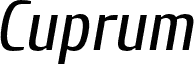
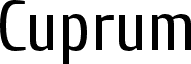
Cuprum Italic, designed by Jovanny Lemonad, is a free condensed sans serif with a brisk forward slant, tall economical proportions, and a noticeably narrow set. Narrow rounded forms, changing stroke widths, and sharply cut endings give the letters a crisp, slightly industrial silhouette with plenty of movement across a line.
It can give event posters and magazine covers the direct urgency of compact editorial lettering without looking severe. On beverage packaging, music merchandise, and venue signage, its taut shapes and angled stance can become a recognizable brand device for products aimed at a young urban market with a practical, modern outlook.
--
Cuprum was created in 2006 based on the work of Miles Newlyn. Cuprum is a narrow grotesque typeface. The name Cuprum means copper, not gold or silver.
This collection of libre fonts was created by designers who drew the fonts and then allowed everyone to use, share, modify, and improve them free of charge. All money received is transferred to the treatment of children with cancer.
Donations can be sent through Yandex Money using account 41001412092310 or through PayPal:
lemonad@jovanny.ru
Enter “Donate” in the payment field.