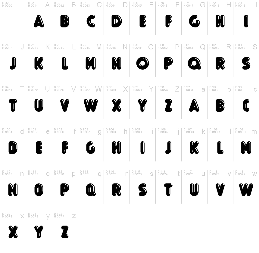
Boule Reduced Brillant
TrueTypeZum persönlichen Gebrauch
BouleReduced-Brillant.ttf
Stichworte
Anmerkung des Autors
Boule Reduced Brillant font is a groovy display typeface designed by ingoFont.
Capitalized, GEOMETRIC, bold and ROUND.
If the typographer sees a font like that, it's enough to make his toes curl. But sometimes it just has to be that way.
Geometrically constructed fonts do not necessarily have to be pointed and angular; It also works consistently around. And if I say it consistently, then in this case, that's done consistently.
The basis for the BOULE is the circle. The letters are drawn with constant line width, the corners and endings all have the same radius, the lines are all the same thickness.
The BOULE consists only of capitals. There is only one difference in the use of uppercase and lowercase letters: in the uppercase letters, the round letters are circular, while the lowercase letters are narrow.
The Boule is not only very fat, it also runs very tight; that is, the glyphs are very close to each other. To avoid "holes" due to unfortunate letter combinations, the Boule contains ligatures for FT, ST, TT and TZ.
There are also other versions of the font: Boule Brillant on the one hand. In this version, simple highlights simulate a light incidence from the top right. These light edges give the font a decorative effect that makes it easy to think of wet sausages or balloons in some shapes.
And finally the Boule Contour. As the name implies, it is the outer contour of the letters, combined with a shadow at the bottom left.
The name Boule (French for ball) says it already: this font is globated. Therefore, it is also very suitable for all three-dimensional alienation effects. With simple light and shadow you can achieve a very convincing 3D effect with little effort.
Zeichentabelle
Benutzen Sie bitte das Pull-Down Menü um verschiedene Zeichentabellen, die in dieser Schriftart enthalten sind, zu sehen.

Standard Schriftarten Information
Urheberrechte
Copyright (c) 2018 by Ingo Zimmermann. Alle Rechte vorbehalten.
Schriftfamilie
Boule Reduced
Schriftunterfamilie
Brillant
Einzigartige Unterfamilieidentifikation
IngoZimmermann: Boule Reduced Brillant: 2018
Vollständiger Schriftname
Boule Reduced Brillant
Name-Tabelle Version
Version 1.013
Postscript-Schriftbezeichnung
BouleReduced-Brillant
Schutzmarken
Boule Reduced Brillant ist eine Marke von Ingo Zimmermann.
Hersteller
Designer
Beschreibung
Copyright (c) 2018 by Ingo Zimmermann. All rights reserved.
Erweiterte Schriftarten Information
Unterstützte Plattformen
PlattformKodierung
UnicodeUnicode 2.0 und nachfolgende Semantik, nur BMP-Unicode
MacintoshWestliche (römische)
MicrosoftNur BMP Unicode
Schriftdetails
Kreiert2019-04-20
Änderung1
Zeichenzahl54
Einheiten pro Em1000
Einbindungs RechteEinbindung für Festinstallation
Familien GattungFreiförmige Serifen
StärkeSehr fett
BreiteEng
Mac StyleKursiv
RichtungNur stark von Links nach Rechts gehende Schriftzeichen + enthält
Muster BeschaffenheitRegelmäßig
AbstandUngleicher Abstand
Komplettes Paket enthält 3 unten aufgeführte Schriftarten:
BouleReduced-Brillant.ttf
BouleReduced-Gras.ttf
BouleReduced-Contour.ttf
BouleReduced-Gras.ttf
BouleReduced-Contour.ttf
Boule Reduced Gras
TrueTypeZum persönlichen Gebrauch
Boule Reduced Contour
TrueTypeZum persönlichen Gebrauch
